Design
How taohq looks and moves. Two colours, three typefaces, dithered art, and a few rules we don't break.
- InkBackgrounds and surfaces
- LavenderAccent: buttons, labels, art, the footer
- PaperText
Crafted with care
Calm, durable, made with care.
Journaling, but cool.
Every image on the site is printed in two tones with an ordered 4×4 Bayer dither, one file pixel per cell. Art never just appears: it develops through these passes, coarse to fine.
 01 · Pass 1
 02 · Pass 2
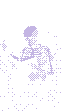 03 · Pass 3
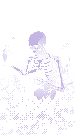 04 · Final
- 01
Segments, not blocks
Every entrance is split into parts that move at their own pace: a label fades, a title rises, an action ticks in last.
- 02
Fast hands
Hovers and presses finish in under 300ms. Only entrances are allowed to take their time.
- 03
Things develop
Art never just appears. It resolves from coarse pixels to fine, like a print coming up.
- 04
Respect stillness
Anyone who asks their device for reduced motion gets the same site, without the movement.
Pixel corners over a dithered print. Hover lifts the face; pressing sinks it in.
Logo files, naming and usage rules live on their own page.
Brand assets